With new autumn/winter clothes continuing to arrive week after week I’m noticing great colour coming through as well. Like every A/W we’re seeing an abundance of grey and black which is great, however at the same time they can be a bit dull and heavy. These two shades/neutrals are great for investment pieces, such as, belts, bags, shoes, jackets, coats, trousers and business suiting. Grey (a combination of white and black) will always be softer and less intimidating than black. It’s a shade that’s considered appropriate when we don’t wish to make a stand and desire to remain less noticeable. Black on the other hand has an authoritative presence and makes a strong impact on those around us.
I am excited however, to see more navy blue in the stores as some seasons it’s almost impossible to find. It’s probably the easiest colour to wear as we all look fabulous in at least one version. Unlike black and grey, blue is the friendliest colour in the spectrum but carries with it authority making it suitable for business also. It will allow blue eyes to pop with more colour, and intensify brown eyes as it’s complimentary to them.
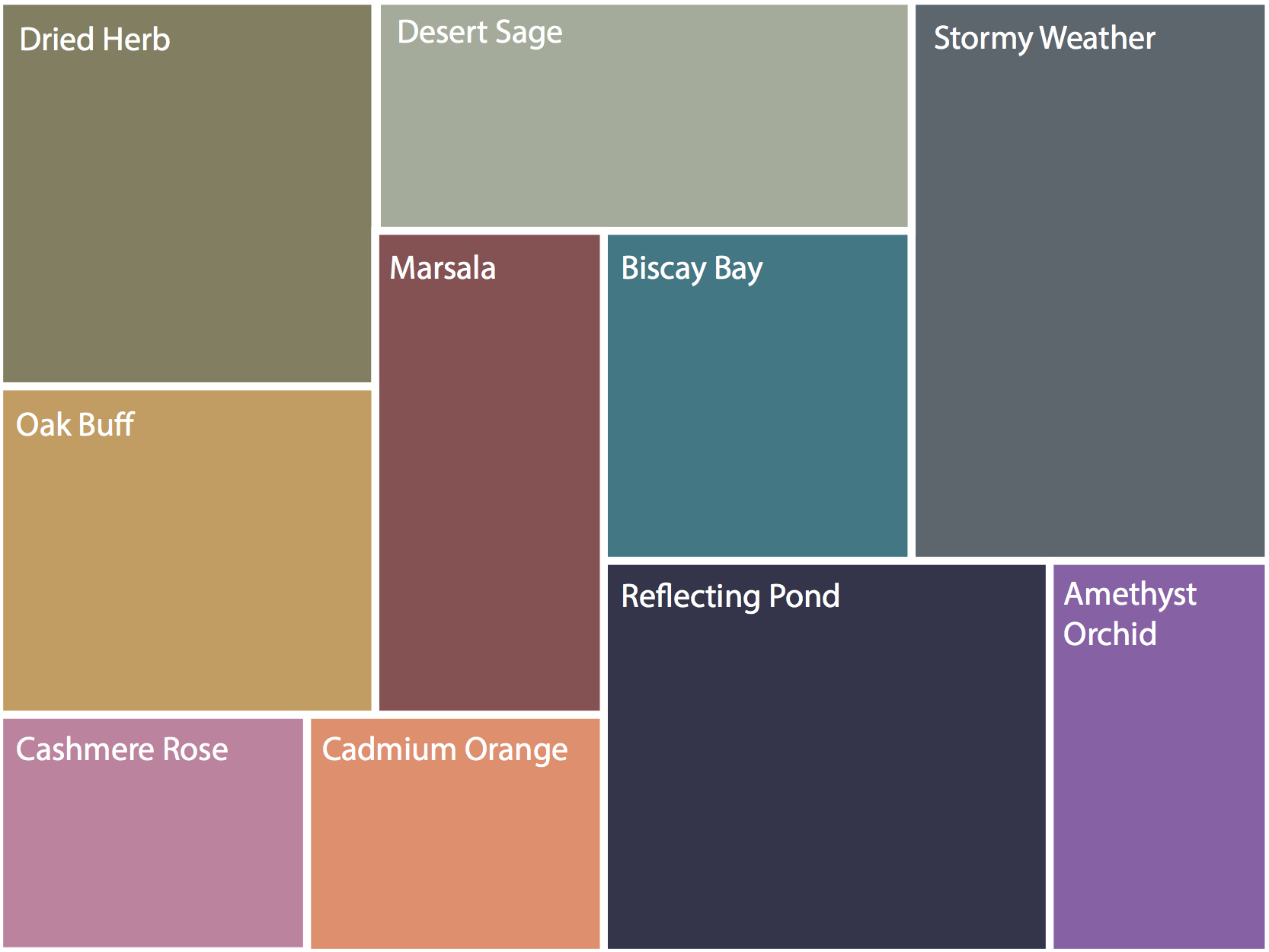
According to Pantone (the global colour authority and provider of professional colour standards for the design industries) the colour forecast this season is the more muted colours rather than brighter ones, like bright orange, cobalt blue and emerald green. This is good news for those who are soft/smoky colouring or where bright colours don’t appeal. Soft smoky colours tend to be more timeless while brighter colours can be used effectively as accent colours or applied in smaller amounts – this can of course depend on your personality and natural colouring. There are a mixture of warm and cool colours that Pantone have selected this season but most are actually warm hues.
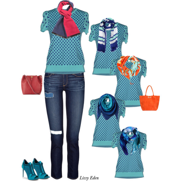
The lovely Biscay Bay is one of the best colours being forcasted this season, and is a universal one. It’s in the form of a teal and has equal amounts of yellow (warm) and blue (cool) allowing all of us to wear it. This is a wonderful colour to really bring in some punch and excitement throughout your outfits.
This is also a fantastic colour to pair with the cool or warm neutrals ‘Reflecting Pond’, and ‘Stormy Weather’ rather than with black. Biscay Bay’ would also make a great monochromatic colour scheme with ‘Reflecting Pond’ – mono meaning one, and chromatic meaning colour. Monochromatic means one colour or different shades of the same colour. That’s the technical meaning of monochromatic! It’s often mistaken for black and white, also white and grey or black, white and grey worn together which are all in fact achromatic (the absence of colour) colour schemes.