I think it’s safe to say that most of us are pleased springs finally here. I’m definitely looking forward to warmer weather and leaving winter well and truly behind. I’m also happy to put away my winter clothes swapping them for my lighter, more colourful spring wear – mustard and orange here I come.
With style interpretations from the 80’s, designers promise spring to be an exciting and inherently upbeat season. A nice change from the 70’s inspired looks we’ve seen over the past few years – just as well I invested in a bomber jacket earlier this year.
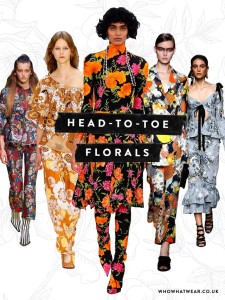
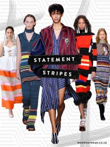
Let’s think exposed and exaggerated shoulders, jumbo frills, embroidery, bold stripes, large florals and head to toe flower prints in everything including shoes and boots. Speaking of florals, you’ll see these matched with stripes in a big way. The beloved maxi dress is back along with micro pleats. Look for high-shine fabrics and draped volume, metallics, sequence and extra large size bling and accessories.
Think romantic and feminine as we’ll see soft luxe fabrics such as semi-opaque, tulle, lace, velvet and comfortable earthy hessian.
We’re also going to see the most saturated colour palette we’ve seen in a decade – meaning super bright colours, such as; fuschia, shocking pink, scarlet, heliotrope, hazmat and more fuschia! This will bring an exciting and refreshing change from all the black, grey and white I seem to constantly encounter when I pre-shop for clients.
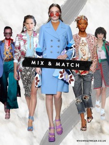
‘Mix and match’ madness is going to come upon us in a big way this season. Céline’s designer Phoebe Philo even went so far as to send her models down the runway in mismatched shoes – who would have thought!
But don’t let ‘mix and matching’ put you off as there are many options if you love the idea.
Principles of Mixing & Matching Clothes and Colours…
1. Personality
Regardless of ‘what’s in’ let your mixing and matching ideas say something great about who you are and always wear it with confidence – this may inspire others too.
2. Colour harmony
When mixing and matching garments of different colours (not neutrals) ensure they have the same saturation or intensity level – for example, yellow and purple. This is very pleasing to the eye as two colours together will complement each other rather than one standing alone or draining the other out.
3. Scale/size and density
Mixing and matching prints and patterns in your outfits look balanced and less busy when one is dense & the other is sparse. Likewise, different size prints and patterns worn together harmonise well.
4. Levels of refinement
Ensure the pieces you’re putting together or mixing and matching have the same or similar levels of refinement. This relates to your clothing style, fabric and accessories.
More on levels of refinement next post.


